Tuesday, August 9, 2011

Before & After - Mudroom


 Welcome in the door of Vinnord. This is my newest project. The equestrian inspired mudroom. Horses are a big part of my life, and I wanted to incoperate that somehow. But traditional equine decor never made my heart skip. I wanted something classic and british, not cowboy-esque and definitly not dark!

So lets take a look at how I did, shall we?
remember you can click the images for larger views :)


This is what I had to work with. The only window in the room faces the roofed porch, meaning it doesnt let in much needed light. The whole room felt unwelcoming and sombre. Unfortunalty it was left this way for the better part of 3 years, due to time and money. In march this year however I finally started. (And I am not done yet)


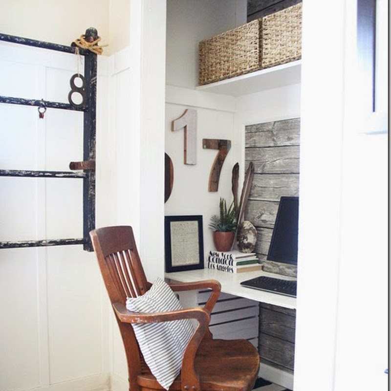
And here is what I ended up with so far. The walls were painted a very light, yet warm, gray. The moldings a darker shade still, and the floors darker yet. The floor is ment to be checkerd some day.


I collected old vintage postcards and had them matted and framed. I kept most the wood a dark brown stain, I like how it works with the lighter shades of gray.


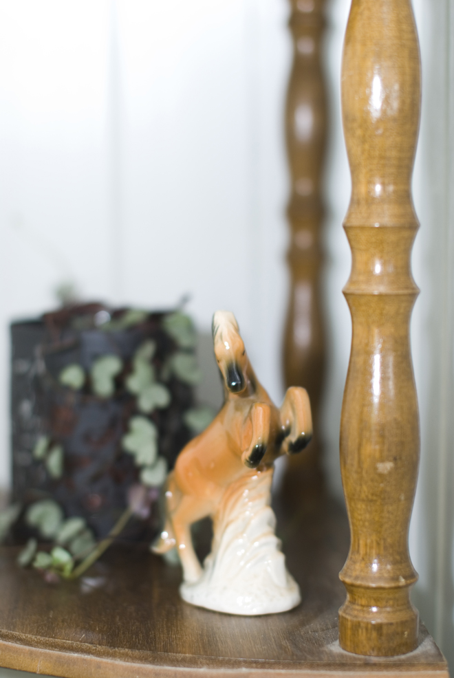
I also collect vintage ceramic horses. More have found their home here since this photoshoot as well.


details like this old bit might just be my favorite.


The stairs were originally clad in horrible, moldy carpets. Yuk! It was so great to have them ripped off. Underneath was hardwood stairs, I simply painted them. The old horse shoes are from my best friend's family farm. They are all different and crooked. People keep telling me they are facing the wrong way, and that the luck will run out. I say the bathe the steps in luck, so everyone walking them will be lucky ;)
The lanterns were a set. Cheap ones that were a horrible red/black colour. I gave them the Vinnord treatment and magiced them into a verdigris finnish!


the doors were painted a light aqua, but I have actually concidered painting them a brighter shade of spring green... inspired by ralph lauren's equestrian style.

The key hanger was a piece left by former owners, I stained it dark.


The horsehead hooks were ebay finds. The 80's velvet helmet a gift from my sister.

Since the pictures for CotM were taken, I have added some new horses to my collection. So lets say hello to them shall we?
The two plates are from Poole Pottery. Found at a charity shop in the UK. The Beswick horses are from a UK carboot. 
Cute arent they? I think they need names!
This smart fella is another carboot find. So cute.


Alot of you have also said you're looking forward the the stable :) Well I hope you are patient. I wont start it untill next summer. We have buildt a temporary one for now, which will not be as cute. Just you know, practical. Allthough I am sure I'll have some cuter details there as well :p right?! Once a decorator, always a decorator.

Next on the cottage tour is the upstairs, which for now is the atlièr :)
Come back for that!
as usual these images were taken by my super talented sister Eva at evafeldmann.com 

Monday, August 8, 2011

Before & After - Kitchen


Continuing on with the before and after series. Showing photos by Eva Feldmann, from the shoot leading up to Cottage of the Month at The Old Painted Cottage.

Remember: you can click ANY photo to make it bigger!


Yeah, it was hard to imagine serene-ness in here. Those faux bois cabinets. The vinyl cork floor. And that sunshine yellow on the walls, dark drapes... It was a sorry sight.

In fact the only part of this kitchen that appealed to me was this old stove. Impractical, but oh-so-beautiful.


The old floor was ripped up. And new vinyl was put in its place. I couldnt afford real wood. But this looks so real it has alot of people fooled. It's a roll-it-out kind of deal. The texture is so lifelike with grooves and all. But it is softer to walk on than real wood of course. The walls were painted a pistchio green, and the cabinets all thrown out and replaced with my favorite cabinets from Ikea. 


I kept that oven of course. On the left you see my collection of vintage green/teal nutbrown & skyline utensils. And I use them too! All the time. The wooden crate is from a local brewery and the lidded container contains catfood.


Yes, I have a tiny fridge (but there is a bigger one hidden in the basement, and there is a hatch leading to there from the floor) Part of the reason I decided on a small fridge was that I wanted a coffee corner. The shelf of drawers were found in a garage, cleaned up and painted. It now holds alot of tea! The old coffee jars were both found at the local Antiques dealer.

an old chippy window serves as a frame for old bookpages from a "farm animals" guide.


old green bottles. Sometimes I keep flowers in them, but mostly they just reflect the light.


Old scales is the nest of a tiny chicken, and the egg whisk was just to pretty to hide away.


Fresh flowers, berries and fruit is decorative, and yummy.


The table was a gift from my grandmother and I belive it belonged to my great grandfather. The chairs were bought at a fleamarket, the pillows at a local "cheap store".


This old shoe shine tote holds my spices. And old mason jars keep sugar, flour and other stuff at hand when cooking.


well that was my kitchen :) I hope you enjoyed it.

I am blown away by all your sweet comments, and all my new followers. You guys are amazing. I try to visit each and everyone of you, but unless you leave a comment I cant seem to find your blog? Only a few of my followers has a link to their own blog via that board... hmmm
Next up is the downstairs hallway. My only equestrian chic room.
Stay tuned!

Friday, August 5, 2011

Before & After - Diningroom


Next on my guided trip around the Cottage is the dining room. Possibly my favorite room in the house!


It used to be pretty dreadful! Dark maroon and loads of pine. This image is from the listing. The only thing I kept really was the hardwood floors! I love that this room has full height beadboard! And the potential was there, hidden behind the layers of dark paint.


I like to think I brought Vinnord back to life. I like to think is how SHE would have wanted to look. Like a welcoming, warm and airy lady. And it is true that this house posseses a certain soul. Everytime you enter the front door your pulse and breathing goes down. You relax, wether you want to or not. Maybe this is why projects take longer here?


The only NEW furniture in my home can be seen here, the glass cabinets were bought at a sale. And I store my ever growing collection of vintage mint-green tablewear in them. The little cabinet was once a horrible dark brown. And is now home to my "large" collection of spirits. Ha ha...


the green shelf was a "I need that" buy at the local interior shop. It adds such a pang of colour. I love it.


this buffet was bought 2nd hand, and I have left it the rather bad paintjob.. for now. I like the depth this ark piece adds to the room. But I have thought about staining it almost black and rub it down.


The decor always changes.... I am forever fiddeling about.


in real life I hate frogs. But in figurines and art I love them. Strange huh?


 there is a bird theme going on in the dining room for sure:)


Wooden candlesticks, painted and distressed. All fleamarket finds.

 I collect naturalia speciemens. Most are displayed in my atlièr, but some always make their way downstairs. Like this urchin. Turquoise pidestal was a flea-find of course, and painted.


the chippy door on the wall is a find from my local antiques dealer. The colour is just perfect of course.
Well that was a roundtrip around my dining room. I hope you enjoyed it. Next up is the kitchen, in just a few days time.

all photos by Eva Feldmann, all styling by me of course.

update:
ther way I am just popping in to answer a question I get asked ALOT these days...
"what paint, and shade, did you use on your dining chairs"?
well I used TWO shades of colour. Both in high glossy oil-based paint (Lady Interior from Norway).
The colour codes are in Norwegian too, and I just dont know if they would work if you give them to international sellers.
The first colour is a darker shade, called "lavender". It is an old colour used alot in the 50's in Norway. A sort of toned down turquoise (gray'ish). It's muted and lovely.
The code for that one is: 3010-G10Y
The lighter shade reminds me more of a tiffany blue. Still muted, but just a tiiiiny bit lighter than "lavender". The code for this one is: S2010-B90G